The basic usage of a header is to simply display the title of the active page. A header in its simplest form is shown below.
<div data-role="header">
  <h1>Header Title</h1>
</div>
Header Positioning
There are three styles available for positioning the header. They include:
- Default: A default header will be shown at the top edge of the screen and will slide out of view when you scroll.
<div data-role="header">
  <h1>Default Header</h1>
</div> - Fixed: A fixed header will always remain positioned and visible at the top edge of the screen. However, during a scroll event the header will disappear until the scroll is finished. We can create a fixed header with the addition of the
data-position="fixed"attribute.<div data-role="header" data-position="fixed">
<h1>Fixed Header</h1>
</div>
NOTE: In order to achieve true fixed toolbars, a browser needs to either support position:fixed or overflow:auto. Fortunately, new releases of WebKit (iOS5) are beginning to support this behavior. In jQuery Mobile, we can enable this behavior by setting the touchOverflowEnabled configuration option to true (see “Configurable jQuery Mobile Options” in Chapter 8 for more details).
- Responsive: When we create a fullscreen page the contents will appear edge-to-edge and the header and footer will responsively appear and disappear based on a touch response. Fullscreen mode is a useful scenario for photo or video displays. To create a fullscreen page add
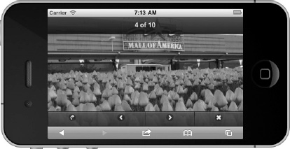
data-fullscreen="true"to the page container and include thedata-position="fixed"attribute on the header and footer elements (see Listing 3–1). For instance, in Figure 3–1 we have a fullscreen page that displays a photo. If a user taps the screen, the header and footer will responsively appear and disappear (see Figure 3–2). In this example, we have a photo viewer with the header showing the counter of our image deck and the footer displays a toolbar to help navigate, email, or delete images.
Listing 3–1. Fullscreen (ch3/position-fullscreen.html)<div data-role="page" data-fullscreen="true">
<div data-role="header" data-position="fixed">
<h3>Header</h3>
</div>
<div data-role="content">
<!-- Fullscreen content -->
</div>
<div data-role="footer" data-position="fixed">
<h3>Footer</h3>
</div>

Figure 3–1. Fullscreen

Figure 3–2. Fullscreen with responsive header and footer
NOTE: The browsers URL bar will be hidden in iOS and Android when viewing jQuery Mobile pages. This is a convenient feature that allows the user to view more available screen real estate and it smooths out the transitions. However, if you need to view the URL bar, drag the page down and the URL bar will become visible.
Leave a Reply