In situations where you need to support multiple actions per list item, we can create a split button list that has a primary and secondary button to choose from. For instance, we can modify our original movie listing example to support multiple actions. Our primary button will continue to show movie details and our new secondary button could be used to purchase tickets (see Figure 5–7).
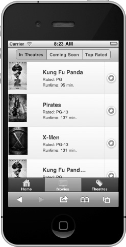
Figure 5–7. List with split buttons
To create a split button, add a secondary link inside the list item and the framework will add a vertical line dividing the primary and secondary actions (see Listing 5–6).
Listing 5–6. List with split buttons (ch5/list-split-buttons.html)<ul data-role="listview" data-split-icon="star" data-split-theme="d">
    <li>
        <a href="movies/kung-fu-panda.html">
            <img src="images/kungfupanda2.jpg" />
            <h3>Kung Fu Panda</h3>
            <p>Rated: PG</p>
            <p>Runtime: 95 min.</p>
        </a>
        <a href="tickets.html">Buy Tickets</a>
    </li>
    ...
</ul>
To set the icon for all secondary buttons, add the data-split-icon attribute to the list element and set its value to a standard (see Table 4–1) or custom icon. By default, the secondary button will be styled with the “b” swatch (light blue) color. To apply an alternate theme, add the data-split-theme attribute to the list element.CopycopyHighlighthighlightAdd NotenoteGet Linklink
Leave a Reply