A jQuery Mobile page template is shown in Listing 2–1. Before we continue any further, let’s get up and running. Copy the HTML template (ch2/template.html), paste it on your desktop and launch it from your favorite browser. You are now running a jQuery Mobile app that should look identical to Figure 2–1 regardless of what browser you are using! The template is semantic HTML5 and contains the jQuery Mobile specific attributes and asset files (CSS, js). Each specific jQuery Mobile asset and attribute is highlighted and explained in Listing 2–1.
Listing 2–1. jQuery Mobile Page Template (ch2/template.html)<!DOCTYPE html>
<html>
<head>
    <meta charset="utf-8">
    <title>Title</title>
    <meta name="viewport" content="width=device-width, initial-scale=1">     1
    <link rel="stylesheet" type="text/css" href="jquery.mobile.css" />       2
    <script type="text/javascript" src="jquery.js"></script>                 3
    <!--<script src="custom-scripts-here.js"></script>-->                    4
    <script type="text/javascript" src="jquery.mobile.js"></script>          5
</head>
<body>

<div data-role="page">                                                       6
    <div data-role="header">                                                 7
        <h1>Page Header</h1>
    </div>

    <div data-role="content">                                                8
         <p>Hello jQuery Mobile!</p>
    </div>

    <div data-role="footer">                                                 9
        <h4>Page Footer</h4>
    </div>
</div>

</body>
</html>- This is the recommended viewport configuration for jQuery Mobile. The
device-widthvalue indicates we want the content to scale the full width of the device. Theinitial-scalesetting sets the initial scaling or zoom factor used for viewing a Web page. A value of 1 displays an unscaled document. As a jQuery Mobile developer you can customize the viewport settings to your application needs. For example, if you wanted to disable zoom you would adduser-scalable=no. However, disabling zoom is a practice you would want to do sparingly because it breaks accessibility. - jQuery Mobile’s CSS will apply stylistic enhancements for all A-Grade and B-Grade browsers. You may customize or add your own CSS as necessary.
- The jQuery library is a core dependency of jQuery Mobile and it is highly recommended to leverage jQuery’s core API within your Mobile pages too if your app requires more dynamic behavior.
- If you need to override jQuery Mobile’s default configuration you can apply your customizations here. Refer to Chapter 8, Configuring jQuery Mobile, for details on customizing jQuery Mobile’s default configuration.
- The jQuery Mobile JavaScript library must be declared after jQuery and any custom scripts you may have. The jQuery Mobile library is the heart that enhances the entire mobile experience.
data-role=“page”defines the page container for a jQuery Mobile page. This element is only required when building multi-page designs (see Listing 2–3).data-role="header"is the header or title bar as shown in Figure 2–1. This attribute is optional.data-role=“content”is the wrapping container for the content body. This attribute is optional.data-role=“footer”contains the footer bar as shown in Figure 2–1. This attribute is optional.
IMPORTANT: The sequence of the CSS and JavaScript files must appear in the order as listed in Listing 2–1. The ordering is necessary to properly initialize the dependencies before they are referenced by jQuery Mobile. Additionally, it is recommended to download these files from a Content Delivery Network (CDN). In particular, you may download them from the jQuery Mobile CDN.1 The files from the CDNs are highly optimized and will provide a more responsive experience for your users. They are compressed, cached, minified, and can be loaded in parallel!
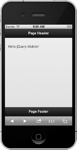
Figure 2–1. Hello jQuery Mobile
__________
1 See http://jquerymobile.com/download/.
TIP: To position the footer at the very bottom of the screen, add data-position=“fixed” to the footer element. A default footer is positioned after the content and not at the bottom of the device. For instance, if your content only consumed half the device height, the footer would appear in the middle of the screen.
<div data-role=“footer” data-position=“fixed”>
Leave a Reply