The jQuery Mobile theming framework allows designers to quickly customize or re-style their user interface. In this section, we will see how we can manually create our own custom swatches. As reviewed previously, the default jQuery Mobile CSS document is broken into two sections: a theme section and a structure section. For this exercise we are going to create a custom swatch that we can reference for potentially dangerous actions. For instance, a common user experience guideline encourages developers to highlight buttons that control potentially harmful actions in red. In jQuery Mobile, we can create a custom swatch to manage the visual styling (backgrounds, borders, color, font, shadows) of icons and/or buttons that drive our risky actions.
To create a custom swatch manually the following steps are necessary:
- First, create a separate CSS file for the custom theme (css/theme/custom-theme.css). This keeps the custom additions separate from the main jQuery Mobile CSS and will simplify future upgrades.TIP: If you plan to style your entire jQuery Mobile application with custom themes it is recommended to use the structure-only CSS file from jQuery Mobile’s download site . This is a lightweight alternative for applications that do not need the default themes and it simplifies the management of the custom themes (see Listing 7–9).Listing 7–9. jQuery Mobile’s structure file without default themes
<head>
  <meta charset="utf-8">
  <title>Custom Theme</title>
  <meta name="viewport" content="width=device-width, initial-scale=1">
  <link rel=stylesheet href="css/theme/custom-theme.css" />
  <link rel=stylesheet href="css/structure/jquery.mobile.structure.css"/>
  <script type="text/javascript" src="jquery-min.js"></script>
  <script type="text/javascript" src="jquery.mobile-min.js"></script>
</head> - Find an existing swatch to reference as a baseline. After studying the existing swatches, copy one that will closely resembles the style of your new swatch. This will help minimize the number of modifications you will have to make in order to create your new swatch. For my new swatch, I copied the “e” swatch as my baseline because “e” is an accent swatch and our new swatch for potentially dangerous actions can be segmented into the accent category too.
- Next, copy the baseline swatch and paste it into the custom-theme.css file. Then, rename the swatch so it is associated to a unique letter (f-z). For example, replace all CSS suffixes with “-e” to “-v” (see Listing 7–10). The new swatch can now be referenced with
data-theme=”v”for any components that perform dangerous actions.Listing 7–10. Custom “v” swatch modeled after swatch “e” (ch7/css/theme/custom-theme9781430239666.css)/* V
----------------------------------------------------------------------*/
.ui-bar-v {
font-weight: bold;
border: 1px solid #999;
background: #dedede;
color: #000;text-shadow: 0 1px 0px #fff;
…
}
.ui-btn-up-v {
border: 1px solid #999;
background: #e79696;
color: #fff;
text-shadow: 0 1px 0px #fff;
...
} - Now the exciting task of updating the visual CSS settings (backgrounds, borders, color, font, and shadows) for our new swatch. For the new “v” swatch, I updated all buttons to have a red gradient background with white text (see Listing 7–11).Listing 7–11. Update “v” swatch buttons with red background gradient and white text (ch7/css/theme/custom-theme9781430239666.css)
/* V
----------------------------------------------------------------------*/
.ui-btn-up-v {
  border: 1px solid       #999;
  background:             #e79696;
  color:                  #fff;
  text-shadow: 0 1px 0px  #fff;
  background-image: -webkit-gradient(
        linear, 0% 0%, 0% 100%, from(#E79696), to(#ce2021),
        color-stop(.4,#E79696)
  );
  background-image: -webkit-linear-gradient(
        0% 56% 90deg,#CE2021, #E79696, #E79696 100%
  );
  background-image:    -moz-linear-gradient(
        0% 56% 90deg,#CE2021, #E79696, #E79696 100%
  );
  ...
} - Next, we need to integrate our new “v” swatch with an actual page for testing. I created two pages to help test the new “v” swatch. On the first page, I wanted to see how the new swatch appeared on an icon-only button. For this test, I created a split button list with the secondary button as our delete icon and styled the secondary button with our new “v” swatch (see Figure 7–12 and its related code in Listing 7–12).
____________________
2See http://jquerymobile.com/download.
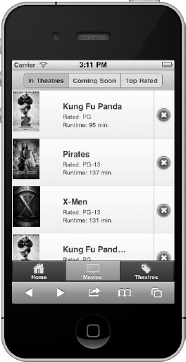
Figure 7–12. Red icon background for potentially dangerous actions
Listing 7–12. Split buttons with “v” swatch (ch7/custom1.html)<head>
  <link rel=stylesheet href="css/theme/custom-theme9781430239666.css" />
  <link rel=stylesheet href="css/structure/jquery.mobile-min.css"/>
  ...
</head>

<ul data-role="listview" data-split-icon="delete" data-split-theme="v">
    <li>
        <a href="#">
            <img src="../images/kungfupanda2.jpg" />
            <h3>Kung Fu Panda</h3>
            <p>Rated: PG</p>
            <p>Runtime: 95 min.</p>
        </a
        <a href="#delete" data-transition="slidedown">Delete</a>
    </li>
...
I also imported our new custom-theme.css file before the main jQuery Mobile CSS file. For our second test, I wanted to apply our new “v” swatch on a delete button. For this test, I created a dialog to confirm the potentially dangerous action and styled the delete button with the our new red gradient styled theme (see Figure 7–13 and its related code in Listing 7–13).
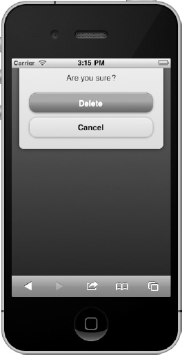
Figure 7–13. Red delete button for delete action
Listing 7–13. Delete button with “v” swatch (ch7/custom1.html)<div data-role="dialog" id="delete">
    <div data-role="content" data-theme="c">
        <span class="title">Are you sure?</span>

        <a href="#home" data-role="button" data-theme="v">Delete</a>
        <a href="#home" data-role="button" data-rel="back">Cancel</a>
    </div>
</div>
Lastly, as you create new swatches, it will be helpful to document your custom styles within a color-coded style guide so all designers and developers within the organization will be familiar with their usage and style.
Leave a Reply