MongoDB Charts
MongoDB Charts lets you visualize your data in a simple, intuitive way.
MongoDB Charts Setup
From the MongoDB Atlas dashboard, go to the Charts tab.
If you’ve never used Charts before, click the Activate Now button. This will take about 1 minute to complete.
You’ll see a new dashboard. Click the dashboard name to open it.
Creating a Chart
Create a new chart by clicking the Add Chart button.
Visually creating a chart is intuitive. Select the data sources that you want to use.
Example:
In this example, we are using the “sample_mflix” database loaded from our sample data in the Intro to Aggregations section.
Under Data Source, select the Movies collection.
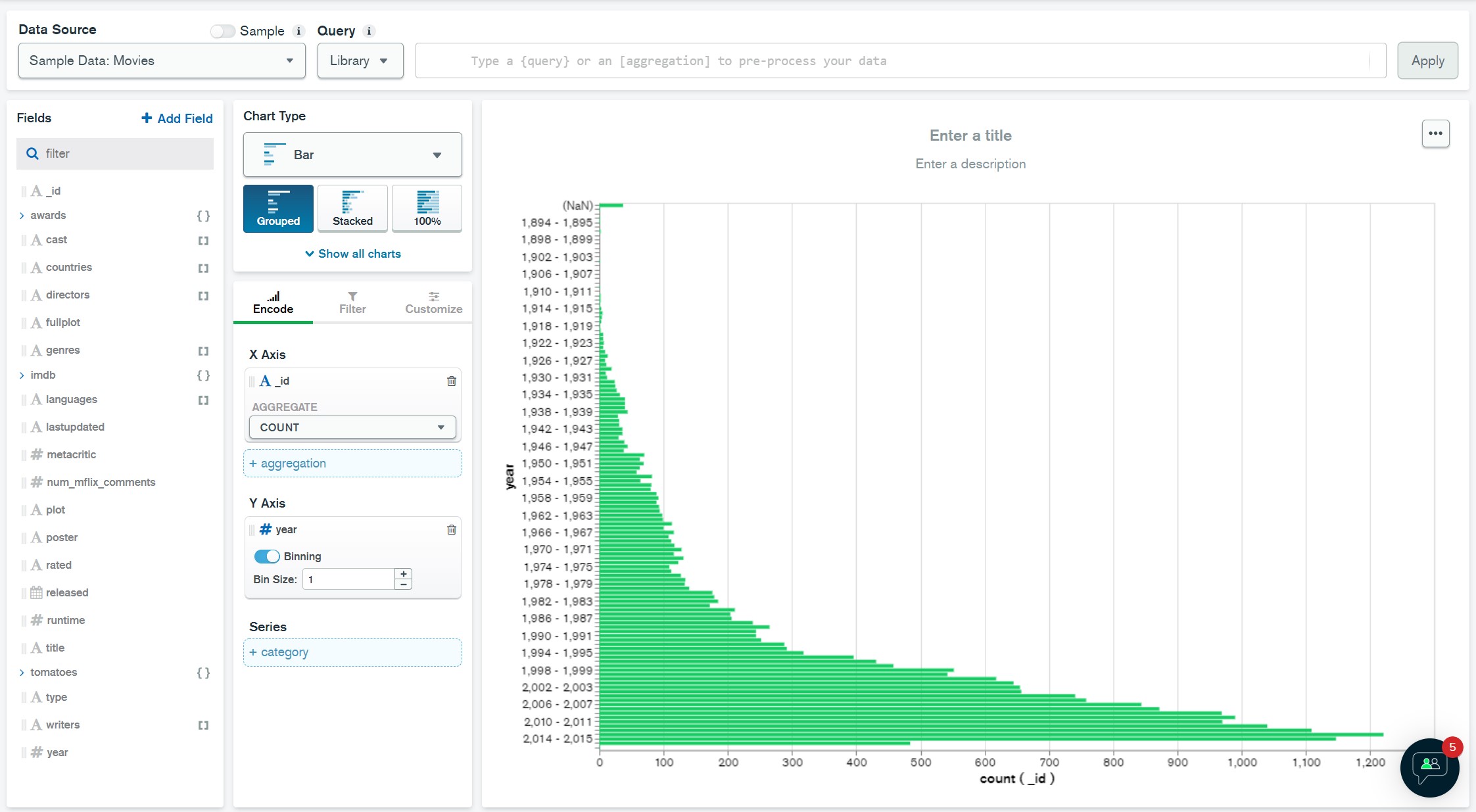
Let’s visualize how many movies were released in each year.
Drag the Year field to the Y Axis field and set the Bin Size to 1.
Drag the _id field to the X Axis field and make sure COUNT is selected for the Aggregate.
You should now see a bar chart with the number of movies released in each year.

Leave a Reply