Thus far, every button example shown had each button segregated from the others. However, if you want to group your buttons together, you can wrap your buttons within a control group. For example, our segmented control examples in Chapter 3 were grouped this way (see Figure 4–8).
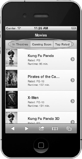
Figure 4–8. Grouping Buttons
To get this effect, wrap a group of buttons in a container with the data-role=”controlgroup” attribute (see Listing 4–8).
Listing 4–8. Grouping buttons (ch3/header-segmented-control.html)<div data-role="controlgroup" data-type="horizontal">
    <a href="#" data-role="button">In Theatres</a>
    <a href="#" data-role="button">Coming Soon</a>
    <a href="#" data-role="button">Top Rated</a>
</div>
By default, the framework will group the buttons vertically, remove all margins, and add borders between the buttons. Additionally, to visually enhance the group, the first and last elements will be styled with rounded corners.
Because buttons are positioned vertically by default, we can style them horizontally with the addition of the data-type=”horizontal” attribute. Unlike vertical buttons that consume the entire width of their outer container, horizontal buttons are only as wide as their content.
CAUTION: When grouping buttons horizontally, the control group will wrap when its width extends beyond the width of the screen.
Leave a Reply